About Project
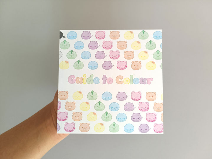
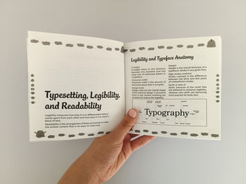
Guide to Colour + Typography is a publication created to help readers grasp the fundamentals of colour and typography in a clear and engaging way. The book features playful, cute characters that add charm and personality, even though they aren’t strictly necessary. One of its most distinctive aspects is its creative layout, two contrasting sections, one on colour and one on typography, are placed back-to-back within a single book, with one section rotated and flipped so that both covers face outward like two sides of a coin. This design choice visually represents the contrast and balance between the two subjects while offering an interactive and memorable reading experience.
Project Overview
My Role:
Author, Illustrator, Graphic Designer
Product Date:
27/027/02/2023 - 14/06/2023 (3 months)2/2023 - 14/06/2023
Product Scope:
Publication
Deliverables:
Book, Poster, Book Marks, Brochure
Guide to Colour + Typography

Project Summary
In this project, I explored the concept of “Print is Not Dead” to identify a print-related topic and design a publication around it. I chose to focus on two elements of print design: colour and typography. While I thought I knew a lot about them, I quickly realised my knowledge was limited. I selected these elements to create a contrasting design within the publication and to deepen my understanding for future projects. I also wanted to explore how much depth there is to colour and typography, beyond simply picking what looks good, as most people underestimate the impact these elements have on the viewer.
The Goal
The goal of this project is to design a publication around the concept of “Print is Not Dead,” focusing on two key elements of print design: colour and typography. I plan to incorporate cute characters into the design to make the publication feel lively and engaging, capturing the attention of readers. The publication will feature two contrasting designs for each element to clearly distinguish between the two subjects.

Research
Visual Investigation
Typography Section
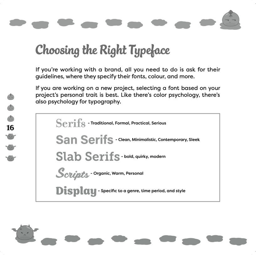
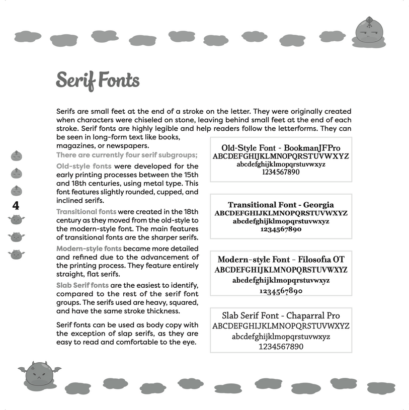
The publication will use vector art for simple, cute, and customisable illustrations created in Adobe Illustrator. A grey monotone colour palette complements the typography theme, evoking traditional ink and pencil tools. Cinema Script, a bold brush script font, is used for headings for a modern, versatile look. The publication will be printed on coated matte paper for a smooth, durable finish without too much gloss.
Colour Section
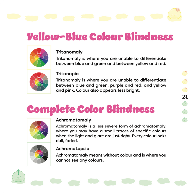
The publication will use vector art for simple, cute, and fully controllable illustrations created in Adobe Illustrator. A pastel rainbow colour palette provides variety without overwhelming the reader, creating a soft and light feel. Jumble is used for headers, a bold, friendly, and whimsical font that feels warm and approachable. The publication will be printed on coated matte paper for a smooth, durable finish with minimal gloss.
Publication Analysis
Three magazine designs were analysed for their layout, typography, and visual impact. The pink magazine features a symmetrical single-column layout with a mix of serif and sans-serif fonts on likely coated matte paper, creating an elegant, calming, and attention-grabbing feel, with a unique square format adding practicality and visual interest. The black-and-white monotone magazine uses a two-column grid on soft matte uncoated paper, with generous white space and sans-serif fonts, resulting in a minimalist, artistic, and documentary-style aesthetic. The pop-art magazine showcases a bright, playful layout with pastel tones, a six-colour palette including black and white, sans-serif typography, and possibly uncoated paper, producing a lively, geometric, and visually engaging design.
What is typography?
Typography is the art of designing and arranging text to make it readable and visually engaging. In print design, it enhances readability and conveys tone or mood. The choice of font, style, and letterform, such as sharp or rounded edges, can express meaning, while variations in weight emphasise key elements. Thoughtful typography creates harmony and strengthens the overall design.
Types of colour in design?
There are three main colour systems in design: RGB (for digital screens), CMYK (for print), and Pantone (for consistent print colours). Colour plays a key role in setting mood and creating harmony or contrast, guided by colour theory and the colour wheel. Colours are grouped as primary (red, yellow, blue), secondary (orange, purple, green), and tertiary, which are formed by mixing a primary with a secondary colour.
Characters Sketches and Development
After sketching, I moved to Illustrator to scan and vectorise each character one at a time. I made small changes, like adding cat ears to Pink, removing horns from Green, and adjusting other details. Each character was placed on its own art board, and areas were expanded and merged for easier editing.
For the coloured characters, I finalised a pastel palette of six colours and created darker shades for outlines and details. Shadows (10% opacity) and highlights (white at 30% opacity) were added to give the slimes a transparent look, with Pink being my favourite.
I then worked on the monotone typography characters, improving four of them and adding shadows and highlights, with my favourite being the third (cat ears with tail).
Next, I created paint/ink puddles by merging ovals, colouring them, and pairing them with each slime to add motion and variety. I made six different puddle tracks per slime, duplicated for all twelve slimes, and plan to continue developing additional elements for the final publication while keeping the same concept.
Concept Development
Design Layouts
The page count and subjects in this layout are rough and not final. Initially, I placed one subject on each side of a page so both could be seen at once, but this made focusing on one subject difficult.
I then explored a layout where one section is flipped upside down, so you can read one subject at a time and flip the book to read the other section. The book will be square-shaped for easy handling. This approach is more engaging than simply placing one subject after the other and allows each section to be read like a separate book within the same publication.

Grid
The final publication will be a square format, about 150mm x 150mm, making it easy to hold and carry. Each subject, “Colour” and “Typography,” will have at least 20 pages, for a total of at least 40 pages. The book’s thickness will depend on the paper weight used.
Design Concept Pages
For the page design concept, I used placeholder text and random images from the visual investigation section. I created a total of 8 pages, 4 from the colour section and 4 from the typography section. I simplified each spread to two colours or tones to keep the design clean and avoid it looking cluttered. I really like how the images turned out, so I may create final versions for the publication using the same method I used for the Slimes.
Identity Summary
Typography Section
Add paragraph text. Click “Edit Text” to update the font, size and more. To change and reuse text themes, go to Site Styles.
Colour Section
Add paragraph text. Click “Edit Text” to update the font, size and more. To change and reuse text themes, go to Site Styles.
Both
Add paragraph text. Click “Edit Text” to update the font, size and more. To change and reuse text themes, go to Site Styles.


