About Project
MicroLife is a fictional pharmaceutical brand specialising in probiotics. The brand is dedicated to the science of probiotics, aiming to explore and unlock the microbiome’s potential to support overall health at every stage of life. MicroLife is also committed to environmental responsibility, prioritising innovative packaging while fostering a collaborative community of people united by a shared mission.
Project Overview
My Role:
Graphic Designer
Product Date:
29/04/2023 - 31/05/2023 (1 month)
Product Scope:
Brand Identity, Packaging
Deliverables:
Product Packaging, Business Cards, Blank Note Cards
MicroLife Probiotic

Project Summary
I developed a fictional pharmaceutical brand and designed three distinct product variations to create a cohesive product range within the pharmaceutical packaging system. This process included establishing the brand identity and producing three packaging die lines and designs prepared for printing, resulting in three physical product packages. The project offered a thorough understanding of designing a packaging system from concept to completion, including die line creation, document setup, and the printing process.

Research
Visual Investigation
I created a visual investigation for this project to explore brand inspiration, packaging types, typography, and colour. MicroLife’s brand identity draws from green tones, natural patterns, and a modern, minimalist aesthetic. The packaging is designed to be innovative, interactive, and reusable, with complementary designs across the product range. Typography features Big Caslon CC for headers, offering elegance and readability, and Filson Soft for body text, providing a friendly, geometric feel. The green monochrome colour palette reinforces the brand’s eco-friendly and sustainable values.
Brand Identity Summary
I developed a Brand Identity Summary for MicroLife, an Australian-made, eco-friendly, and affordable probiotic brand focused on the human microbiome and its connection to the environment. Emphasising innovation, sustainability, and transparency, MicroLife uses reusable packaging and clear communication through social media. Its visual identity features green tones and minimalist packaging. Vegan, gluten-free, and science-backed, MicroLife presents itself as a sustainable, trustworthy brand that promotes both health and environmental awareness.
Identity analysis
I conducted an identity analysis of three probiotic brands, Life-Space, Seed, and Nature’s Way, comparing their design, typography, colour, and visual style. Life-Space uses a clean blue, grey, and white palette with Montserrat type and clear icons, though similar colours across products can cause confusion. Seed takes a minimal, eco-friendly approach with green and white tones but has a cluttered website. Nature’s Way feels family-friendly and approachable with bright colours for easy differentiation, though its packaging appears somewhat generic.
Research Insight
My research focused on the pharmaceutical field relevant to my fictitious company, specifically probiotics. The human microbiome is a complex ecosystem of microbes living on and inside the body, supporting health when balanced but potentially harming wellbeing when disrupted. Probiotics are live beneficial microorganisms found in fermented foods and supplements that help support various body systems, measured in CFUs (colony forming units). Different strains provide different health benefits, and they are most effective when taken with meals and spaced at least two hours apart from antibiotics. Prebiotics, on the other hand, are non-digestible foods that nourish beneficial bacteria. Microbiome needs vary across life stages, so selecting the right probiotic strain is important. Desiccants help preserve probiotics by absorbing moisture, and while probiotics are generally safe, individuals with serious illnesses or weakened immune systems should consult a doctor before use.
Brand Name
I began brainstorming brand names by writing down words that came to mind when I thought of pharmaceuticals. From that list, I combined different words to form unique name ideas. The final choice was MicroLife. I selected this name because it connects to the microbiome, micro meaning “small” and bio meaning “life.” Combined, they reflect the concept of “small life,” making MicroLife a fitting name for the brand.
Concept Development

Logo Development
For the logo, I chose a word mark, using the brand name as the main design. I started with the Bookmania Bold font because it’s a modern, easy-to-read serif that suits the brand. To make it more unique and visually softer, I rounded the edges of the letters and replaced the dots on the “i” with simple leaf shapes to reflect the brand’s values.
Rapid Prototyping
The packaging prototyping explored nine concepts, each testing different ideas for usability, brand fit, and uniqueness. Some concepts were unique, interactive, or easy to assemble, while others felt too similar to existing products, not original to the brand, or impractical to construct. Designs ranged from Yakult-inspired bottles, modular storage boxes, dairy-themed multi-packs, simple reusable boxes, interactive packaging, and cylindrical designs with vertical openings. Overall, each prototype offered valuable insights into what worked, such as simplicity, ease of use, and brand alignment, and what didn’t, including confusion with other brands, difficult construction, or lack of distinctiveness.
Final Prototyping
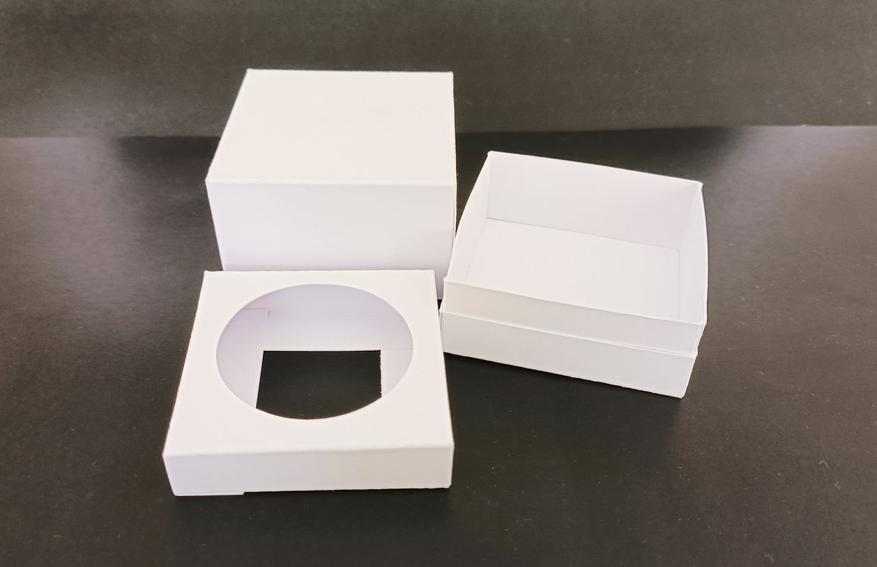
For the final prototype, I chose a simpler cube-style design. While it’s not as unique as some of the earlier concepts, it aligns well with the MicroLife brand. The lid is designed to cover most of the box’s height, allowing key product information to sit on the sides of the lid. When opened, it reveals the probiotic bottle clearly and neatly.
I created two versions of this prototype: one sized for a single 30-capsule bottle, and another that holds three 30-capsule bottles. There will also be a version for the 60-capsule bottle, but since this only requires a taller lid, I didn’t prototype it separately.
Each box is made up of three components once assembled: the base, the lid, and an insert to hold the bottle in place. The base itself is formed from two pieces, making a total of four cut pieces per box before assembly.
Print Document Layout
This layout uses three pages, each measuring 320 × 450 mm, with a 310 × 440 mm artwork area. Across the three pages, there is enough space to fit all four packaging designs.
Final Prototyping
For the final prototype, I chose a simpler cube-style design. While it’s not as unique as some of the earlier concepts, it aligns well with the MicroLife brand. The lid is designed to cover most of the box’s height, allowing key product information to sit on the sides of the lid. When opened, it reveals the probiotic bottle clearly and neatly.
I created two versions of this prototype: one sized for a single 30-capsule bottle, and another that holds three 30-capsule bottles. There will also be a version for the 60-capsule bottle, but since this only requires a taller lid, I didn’t prototype it separately.
Each box is made up of three components once assembled: the base, the lid, and an insert to hold the bottle in place. The base itself is formed from two pieces, making a total of four cut pieces per box before assembly.
Final Packaging
There were a few issues with the packaging. The colours I used were from an older version of the palette, which resulted in the printed packaging appearing darker than intended. In addition, the Double Strength and Probiotic Powder individual packages ended up using the same green, even though the Probiotic Powder should have been a lighter shade.
I’ve since reprinted the packaging using the correct, updated colour palette, but I wasn’t able to assemble them in time. I will update them at a later date.


