


About Project
The Communication Collective is Murdoch University’s student chapter for communication students. It provides a space for students to connect with peers in communication and media, building a supportive network throughout their studies. In 2014, the chapter expanded to include students from Strategic Communication, Web Communication, Journalism, and Global Media and Communication. Previously, it primarily catered to PR and Strategic Communication students.
Project Overview
My Role:
UX/UI Designer
Product Date:
26/02/2024 - 07/06/2024 (3 Months)
Product Scope:
Website
Deliverables:
Website, Website Handover Doc
My Team:
Sean Chionh (Team Leader), Treyden Tallent, Adria Cheung (Me), Jiabin Zhang
The Communication Collective

The Design Challenge
We were tasked with redesigning and updating The Communication Collective at Murdoch University website for the Communication major. The existing site had not been updated for over a year and a half, and it lacked several key features they needed.
The Goal
Our main goal was to redesign and update the website with the following objectives:
-
Promote the student chapter
-
Engage and attract members
-
Inform the public about events and study the courses
-
Work as a learning tool for student content and web creators
-
Gather data
The website also needed to be designed and programmed so future administrators could easily access and edit content without risking any technical issues or breaking the site.

Research
Brand Identity Summary
We also developed a Brand Identity Summary to ensure the product’s design aligns with the brand’s values. By analysing the brand identity, we created a design that reinforces The Communication Collective’s fun, engaging, and professional image.
Competitive Analysis
We conducted a competitive analysis to identify effective and ineffective design elements, guiding our own design decisions. By examining competitor websites, we can adopt successful features, such as the clear navigation of Notre Dame Law Students’ Society (NSLSS), while avoiding less effective aspects, like the uninspiring design of Curtin Public Relations Student Chapter (Curtin PRSC).
User Personas
We developed two user personas, including empathy maps, UX problem statements, journey maps, how might we (HMW), and minimum viable products (MVPs), to better understand user needs and experiences.
Persona 1: Mariana Garrison, an outgoing B-COM student, needs an easy way to access events, course details, and learning tools through the “Communication Collective” websites. With her busy schedule, her main challenge is the lack of a centralised platform for all this information.
Persona 2: Feng Duan, a Chinese international student, needs quick access to key details about events and the communication major. As he explores universities and majors, his main challenge is deciding where to study. If he chooses Murdoch University, he’ll use the “Communication Collective” websites to stay informed.
Interview
Our user research began with an interview with Renae Desai (Associate Professor and main contact for this project) to gain insight into their goals, expectations, and project requirements.
Concept Development
Content Audit
The content audit showed the current condition of the website, while the persona research revealed key missing elements such as an events page and a news feed. It also highlighted confusing navigation, for example, placing ‘Alumni’ and ‘Past Committees’ under the ‘About’ section felt unintuitive. This review of the site structure helped identify what already exists and guided decisions for future improvements.

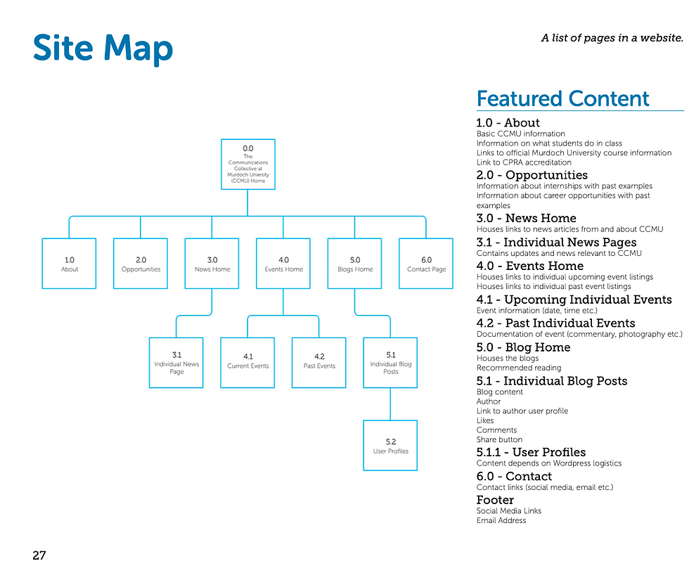
Site Map
The site map visually outlines the planned content based on our strategy. It shows the main navigation structure and provides brief descriptions of what each page includes. This helped clarify the website’s requirements, guided by our persona research and the issues users identified.


Digital Wireframes
Digital wireframes outline the website’s structure, layout, and content placement, including early design elements like colour, imagery, and typography. We created wireframes for desktop, tablet, and mobile to ensure the site is fully responsive and provides a seamless user experience across all devices.
Each team member was responsible for wire framing, designing, and coding specific sections of the website:
Sean (Team Leader): Home page, Treyden: Oppprtinities and About page, Adria (Me): News and Events pages, Jiabin: Blog page.
Usability testing
The website is visually appealing but lacks clarity. Users found the wording and headings difficult to follow, making it unclear what the site represents at first glance. The homepage image also felt generic and disconnected from the concept. Feedback highlighted inconsistencies in spelling, capitalisation, and image quality. Although navigation was clean and intuitive, the navbar blended in too much. Improving clarity, wording, imagery, and overall consistency would strengthen the user experience.
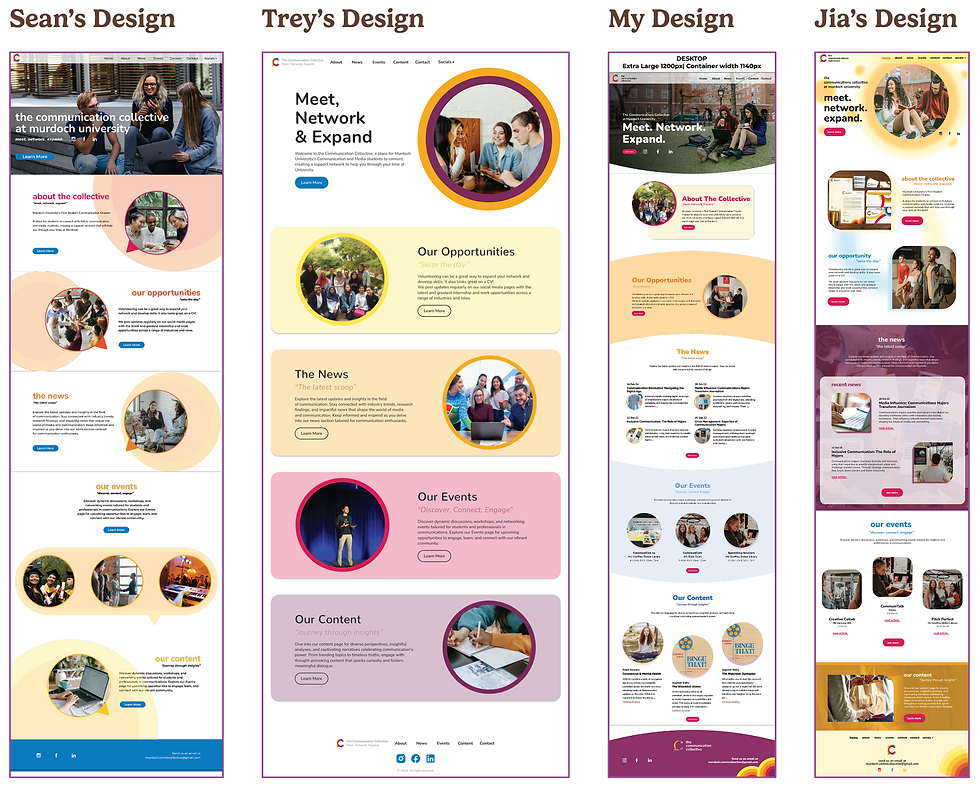
Iterations of the Home Design Concepts
The team leader was responsible for the homepage wireframe and coding. However, each team member created a home page design concept to present to Renae Desai, our main client contact. The final website pages were designed based on the selected concept, ultimately, the team leader’s design was chosen.

Iterative Development of My News Design Concepts
I designed the News page to align with the home page concept, incorporating the coloured header and speech-bubble imagery. Some adjustments were necessary during development—for example, the alternating layout for recent news articles was simplified for consistency, and the idea of colour-coded news posts was removed as it would have been too complex to implement in WordPress. I also updated the WordPress header to better match the style of the About and Opportunities pages.

Iterative Development of My Events Design Concepts
Similar to the News page, I designed the Events page using the same coloured header and speech-bubble imagery, and encountered the same challenges. As with the News section, I updated the WordPress header to better align with the style of the About and Opportunities pages.
Final Product


